Case Study: Apptivist
An app to facilitate participation in community activism
Designed by: Margot Hamer
Project Status: MVP usability testing
Project Duration: 3 months
Tools: Miro, Figma, Zeplin, Lookback
Project process
Challenge
Initial Discovery
Definition
Concepts
User Journey
6. Prototyping
7. Testing
8. Iteration
9. Accessibility
10. and Repeat!
The challenge:
How can we connect talented motivated individuals with local organisations that need their skills? How can we bring people together to solve issues within our communities?
In cities all over the world there are organisations tackling problems across a variety of social issues and causes. There are also residents who want to give back to their community but do not know where to start.
Enter Apptivist, a platform to connect people for social change.
2. Initial Discovery
I wanted to understand how users were interacting with organisations in their area, what pain points they were experiencing and what tools they were using. This allowed me to see if there was a gap in the market that could be filled by a new app, and if so what kind of features users might want.
I conducted user interviews with 12 users of varying ages to get qualitative insights:
I'd like to find ways to contribute directly to my immediate community”
— User 1
“If I knew more about volunteer opportunities in my area I would donate more of my time”
— User 2
“I'd love to be able to look for organisations in my area that deal with issues I care about”
— User 3
-
Research
1 on 1 video interviews
Qualitative data

-
Analysis
Affinity diagramming
Identify themes & opportunities

-
Synthesis
Feature ideation
Feature prioritization - complexity vs value

3. Definition
By the end of the synthesis phase, I have defined a roadmap and a feature list, which includes plans for phase 1, MVP and future state features.
Phase 1:
Log in flow
Listings
Search & filter
MVP
In-app calendar
Favourite listings
Customizable notifications
4. Concepts
Rapid prototyping by hand
Crazy eights and freeform ideation techniques
From content mapping to UI elements to screen-views
5. User Journey
User journey map lays out the steps users will take. This defines the number and order of screens & modals to be designed.
Based on the user journey map a clickable wireframe was created for user testing. Testing feedback informs 2nd iteration of user journey and wireframes.
6. Prototyping
-

Low fidelity
Wireframe for user journey testing
-

Mid fidelity
Design screens with limited functionality to test specific tasks
-

High fidelity
Design screens with content and extended functionality
7. Testing
Feedback Synthesis
At the mid-fidelity stage, I used Lookback to do remote unmoderated testing with a variety of potential users.
The prototype scored 98% task completion across 6 separate tasks, though some areas of improvement were highlighted.
Further trials may incorporate A/B testing to confirm which of two iterations is the most user-friendly.
Following each testing round, results are synthesized and improvements prioritized for the next iteration.
Iteration happens at every stage of the design process.
Clear and regular communication with all stakeholders and team members is essential to ensure expectation alignment throughout development.
8. Iteration
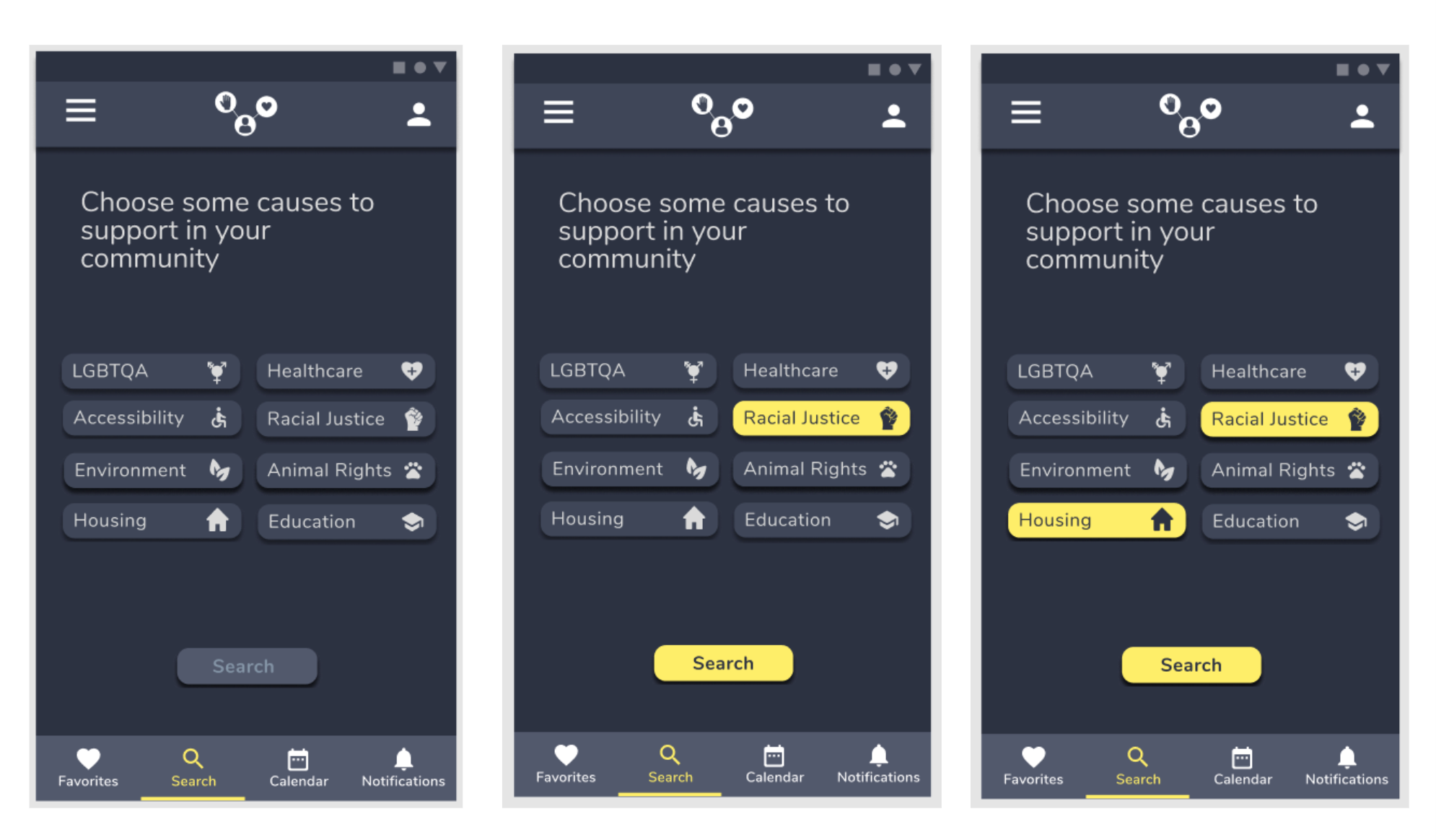
During testing I found that this flow presented some confusion to users.
100% of participants selected one cause and then immediately clicked the “Search” button when it became active. The intention here is to allow users the option to select multiple causes.
Hypothesis
The visual cue of the highlighted button is stronger than the copy encouraging the user to select “some causes” so all users immediately clicked “Search” when it became active, rather than looking for additional causes to support.
Based on the hypothesis above, I created 2 alternative designs to review using A/B testing
V1 (left) updates the copy to state the expected behaviour more clearly. Giving the user a number of causes to select may be seen as a more definite call to action that encourages selection of further filters.
V2 (right) also incorporates updated copy and the “Search” button remains active throughout the flow.
9. Accessibility
Designing all UI to meet or exceed WCAG requirements for legibility ensures that the app is as user-friendly as possible for users with visual impairments.
In the example below, the first design (left) featured error messaging that was low-contrast and potentially tricky to read. The revised version (right) uses a darker ground and a heavier font to improve contrast and legibility.
10. And repeat!
Apptivist is a student project currently in phase 1 testing.
3 of the 6 projected MVP features have been prototyped and tested successfully.
Next steps:
Develop & test 3 remaining MVP app features
Collate user testing feedback to produce high-fidelity prototype of MVP
Development!


